
For most of blogging’s history, the sidebar was just… there. A column on the right, stuffed with a search bar, a tag cloud, a list of recent posts, maybe some badges from blogging networks that no longer exist. It was so standard that removing it felt almost rebellious.
Then something shifted. Editorial sites started going full-width. Medium built an entire reading platform without one. Lifestyle bloggers started dropping their sidebars one by one. Suddenly the sidebar felt less like a feature and more like a habit nobody had thought to question.
So is the sidebar actually dead? Or is this just design fashion masquerading as progress?
The honest answer is: it depends on your blog. But there’s a lot more to unpack than that — because the sidebar debate is really a proxy for a bigger question about what your blog is actually for and how your readers actually use it.
Where the Sidebar Came From
The sidebar has its roots in early web design conventions from the late 1990s and early 2000s, when screen space was limited and information density was prized. Sidebars were a practical solution: a way to surface navigation, search, and secondary content without cluttering the main column.
For a long time this made sense. Readers expected it. Advertisers loved it — banner ad slots in the sidebar became a significant revenue stream for big blogs. Widgets gave bloggers an easy way to add functionality without touching code.
But the web has changed considerably since then. Screens got wider, then mobile took over entirely. Reader behaviour shifted. And the content itself evolved — long-form posts, visual storytelling, and immersive reading experiences became the currency of successful blogs. The sidebar, designed for a different era, started to look increasingly out of place.
The Case Against the Sidebar
Let’s be direct about the reasons bloggers are ditching them — because some of them are genuinely compelling.
1. It competes with your content for attention
A sidebar is, by definition, a distraction. It sits next to your article asking for attention while your reader is trying to read. Every element you put in it — a widget, a banner, a list of popular posts — is a small cognitive interrupt pulling focus away from the thing you actually want people to engage with.
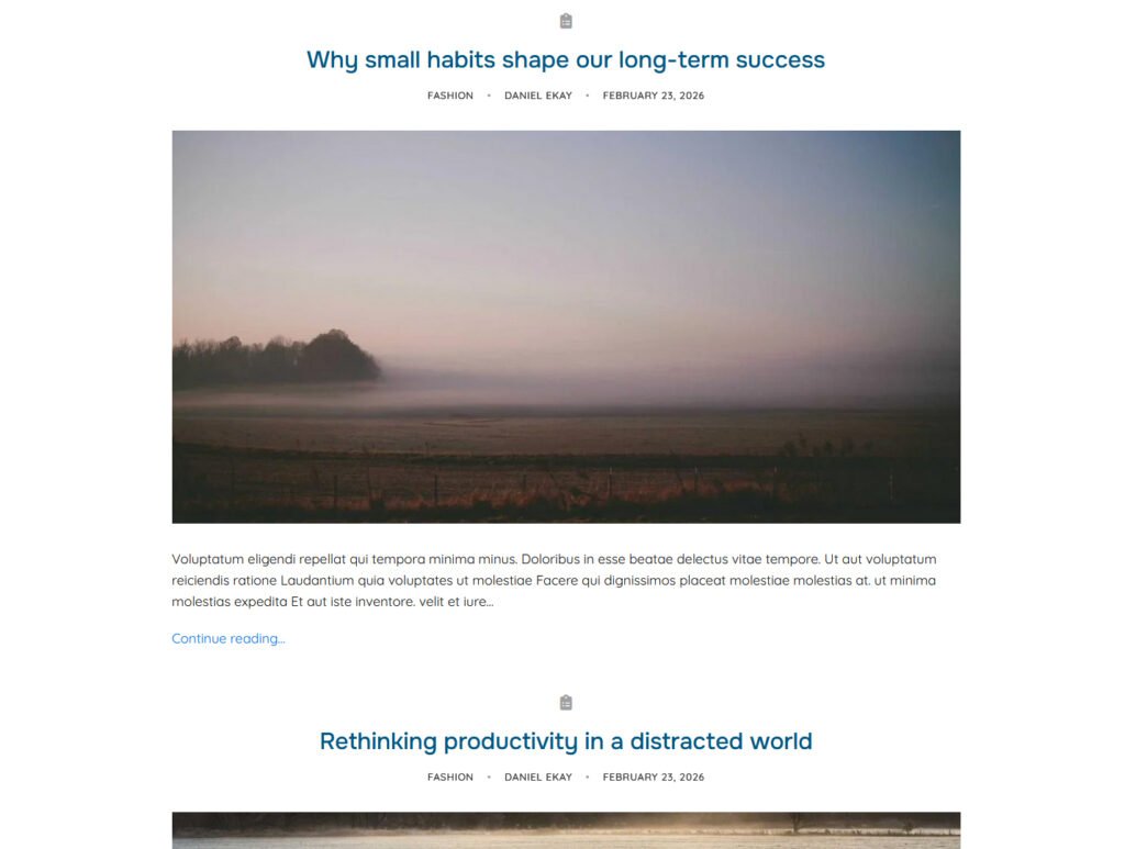
If your goal is to get readers absorbed in your writing, a sidebar works against you. The best reading experiences — Medium, Substack, the New Yorker online — are all full-width for exactly this reason.
2. It's almost always neglected
Be honest: when did you last update your sidebar? Most blog sidebars are a graveyard of outdated widgets, broken Instagram feeds, and social follow buttons for platforms the blogger has quietly stopped using. A neglected sidebar doesn’t just look bad — it signals that the blog itself might be neglected.
Full-width forces you to think more carefully about what secondary content genuinely serves readers, because you have to integrate it into the post itself rather than hiding it in a column.
3. Mobile made it redundant
On mobile — which accounts for the majority of blog traffic for most lifestyle and personal blogs — the sidebar collapses below your content anyway. Your reader never sees it in the context you designed it for. You’re designing an element that exists, for most of your audience, below a fold they’ll never reach.
The numbers back this up: mobile traffic now accounts for over 60% of global web traffic. If your sidebar is primarily a desktop feature, you’re designing for a minority of your readers.
4. Full-width looks more editorial and modern
This is admittedly subjective — but it matters. Full-width single post layouts have become the visual language of serious, quality content. When you remove the sidebar, your post layout immediately reads as more intentional, more focused, and more professional. The content gets to breathe.
The blogs that feel most premium in 2026 — the ones readers screenshot and share and want to emulate — are almost universally full-width.
The Case For Keeping It
The sidebar isn’t dead everywhere. There are legitimate reasons to keep one, and it’s worth being honest about them.
1. It genuinely helps navigation on content-heavy blogs
If you publish across many categories and your readers regularly browse for content — rather than arriving from search, reading one post, and leaving — a sidebar can surface related posts, categories, and search in a way that keeps them on your site longer.
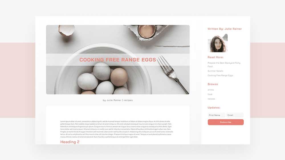
This is particularly true for food blogs, DIY blogs, and news-adjacent blogs where readers come back repeatedly to browse. For those use cases, the sidebar earns its place.
2. It works for monetised blogs with display ads
If you’re running display ads — Mediavine, AdThrive, or direct placements — the sidebar is valuable ad inventory. Removing it can meaningfully impact revenue if ads are a significant income source. This is a pragmatic consideration that deserves honest acknowledgement.
That said: if ads in the sidebar are hurting the reading experience, you might be trading long-term reader loyalty for short-term ad impressions. It’s a calculation worth making consciously rather than by default.
3. Some niches expect it
News blogs, recipe blogs, and certain technical blogs have audiences that are so accustomed to sidebars that removing them can feel disorienting. Reader expectations are part of the equation. If your niche has strong conventions, breaking them requires a reason beyond aesthetics.
Side by Side
| Sidebar ✓ Keep If... | Full-Width ✓ Switch If... |
|---|---|
| • Heavy browsing behaviour (returning readers) | • Most traffic comes from search (single-post readers) |
| • Display ads are a meaningful income source | • Mobile is 50%+ of your traffic |
| • Content-heavy niche with navigation needs | • You want a cleaner, more editorial reading experience |
| • Your audience is predominantly desktop | • Your sidebar is outdated or neglected |
| • You actively maintain and update sidebar content | • You're building a personal brand around long-form writing |
The Middle Ground Most Bloggers Miss
Here’s what gets lost in the sidebar debate: it’s not binary. You don’t have to make the same choice across every page type on your blog.
The smartest approach most established bloggers take is a hybrid:
- Full-width on single posts — where you want focused reading and maximum content immersion
- Sidebar on archive and category pages — where browsing behaviour and navigation genuinely help
- Full-width on the homepage — where first impressions matter and editorial feel is everything
This gives you the best of both worlds. Readers who arrive on a post get a clean, distraction-free reading experience. Readers who are browsing categories get navigation help. And your homepage makes the right first impression.
Aurora lets you set sidebar behaviour independently per page type — full-width on single posts, sidebar on archives — without any code. It's one of those layout decisions that's worth spending five minutes on in the Customizer, because it affects every single post you publish.
How to Decide for Your Blog
| If your blog is... | Go... |
|---|---|
| Primarily long-form articles, personal brand focus | Full-width single posts. Consider hybrid for archives. |
| Food, recipe, or heavily browsed content | Keep the sidebar — navigation helps here. |
| Lifestyle or personal blog, mostly mobile readers | Full-width. Your sidebar isn't reaching them anyway. |
| Monetised with display ads as primary income | Keep sidebar for ad inventory. Optimise for readability within that constraint. |
| Just starting out, building an audience | Full-width. Start clean. You can always add complexity later. |
| Multi-category blog with returning readers | Hybrid — full-width posts, sidebar on category pages. |
The Honest Verdict
The sidebar isn’t dead — but it is on notice. For most personal and lifestyle bloggers in 2026, especially those whose primary traffic comes from search, full-width is the better default. It’s cleaner, more modern, and better suited to how most readers actually consume content.
But ‘most bloggers’ isn’t you specifically. If your sidebar is genuinely useful — if it’s maintained, relevant, and serves your readers’ browsing behaviour — keep it. The goal is never to follow a trend for its own sake. It’s to give your readers the best possible experience for how they actually use your blog.
Take ten minutes to look at your analytics. What percentage of your traffic is mobile? How many pages per session are your readers visiting? Do they actually use your sidebar widgets? The answers will tell you more than any design trend.