Every Aurora header layout is built around the same set of configurable elements. The layout determines how they are arranged; the Customizer controls what appears and how. Here is everything available in the header.
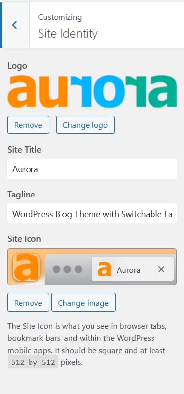
Logo
Upload your site logo from Appearance → Customize → Site Identity. Set independent widths for desktop, tablet, and mobile. A separate footer logo can also be uploaded. See How to Add a Logo to Your Header and How to Configure Responsive Logo Widths.
Primary Navigation
Assign any WordPress menu to the Primary Menu location and it appears in the header. Dropdowns are supported on all layouts. See How to Assign a Primary Menu.
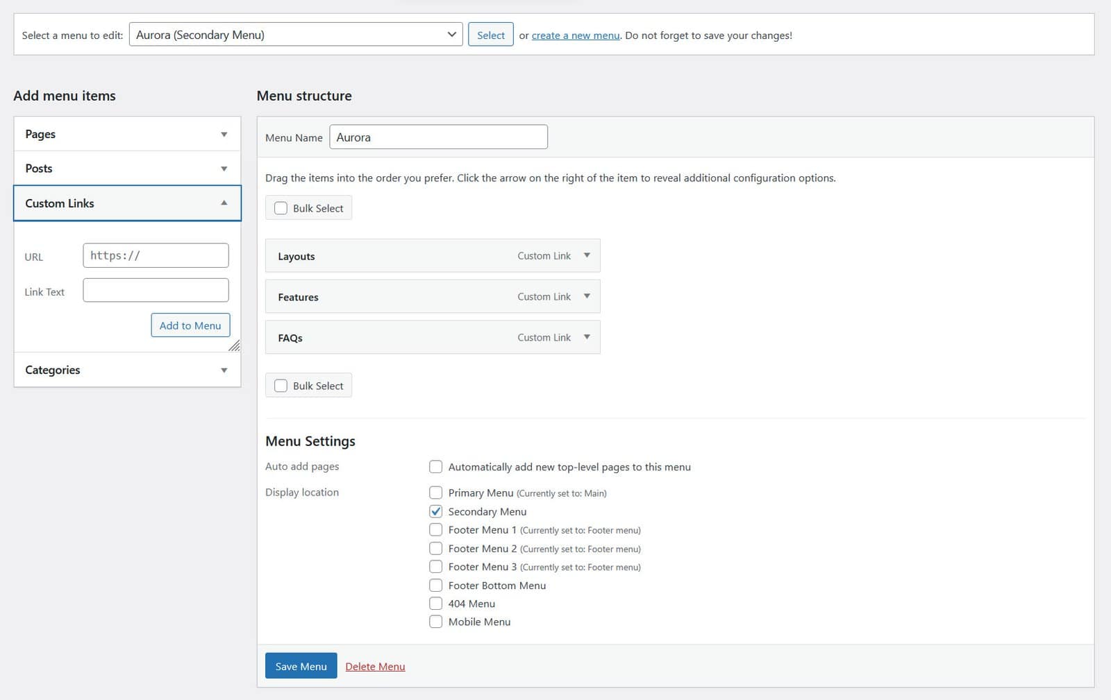
Secondary Navigation
Three horizontal headers display a secondary menu in a hamburger-triggered panel: Apex, Overlay, and Vanilla. Assign a menu to the Secondary Menu location to populate it. Apex and Overlay use a floating panel that slides in from the left. Vanilla uses a full-height side panel. Other layouts do not show a secondary menu.
CTA Buttons
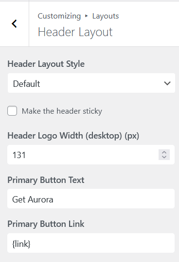
Add up to two call-to-action buttons to the header, each with its own label, URL, and style. Configured from Customize → Layouts → Header Layout. See How to Add CTA Buttons to the Header.
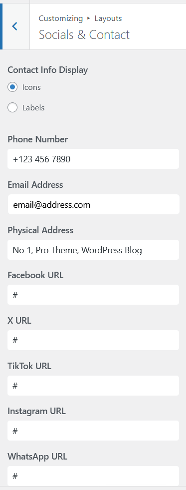
Social Icons
Display icons linking to your social profiles in the header. Icons appear for any platform with a URL entered under Customize → Socials & Contact. See How to Add Social Icons to the Header.
Contact Info
Show a phone number, email address, or other contact detail in the header. Configured from Customize → Socials & Contact. See How to Display Contact Info in the Header.
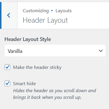
Sticky Header
All six horizontal header layouts support a sticky header that stays fixed at the top of the page as visitors scroll. Enable it with a single toggle. See How to Configure the Sticky Header.
Mobile Menu
On small screens, Aurora collapses the header navigation into a hamburger icon that opens a slide-out drawer. Assign a dedicated Mobile Menu location for a separate mobile navigation, or leave it unassigned and the Primary Menu is used automatically. See How to Set Up the Mobile Menu.
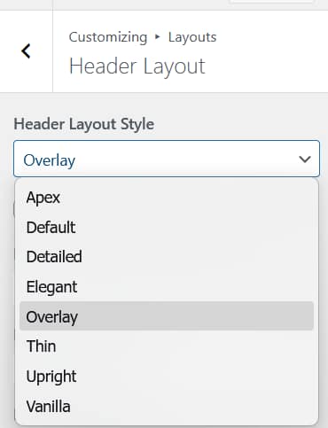
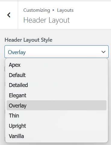
Header Layout
Choose from eight header designs: six horizontal and two vertical panel layouts, each with its own arrangement of the elements above. Switch from Customize → Layouts → Header Layout. See Aurora Header Layouts: All 8 Designs Compared.