

Aurora ships with 8 header layouts. Six are horizontal bar designs and two are vertical side panels. This page compares all 8 so you can choose the right one for your site.
No header has fixed colors. Every color — background, text, buttons, icons — comes from your color settings. The colors shown on the demo site reflect that site’s configuration and will not appear on your site unless you choose the same settings. The only exception is Overlay’s main bar, which has a fixed white background.
Quick Comparison
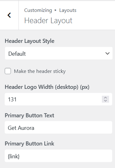
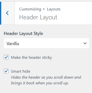
All horizontal headers can be made sticky with a single toggle under Customize → Layouts → Header Layout → Make header sticky. Vertical headers (Thin and Upright) are always fixed by nature and do not need the toggle.
| Layout | Type | Bars | Socials | Contacts | Header Buttons |
|---|---|---|---|---|---|
| Apex | Horizontal | 2 | Yes | No | 1 |
| Default | Horizontal | 1 | No | No | 2 |
| Detailed | Horizontal | 2 | Yes | Yes | 2 |
| Elegant | Horizontal | 2 | Yes | Yes | 1 |
| Overlay | Horizontal | 2 | Yes | No | 2 |
| Thin | Vertical | 1 | Yes | Yes | 2 |
| Upright | Vertical | 1 | Yes | No | 2 |
| Vanilla | Horizontal | 1 | Yes | Yes | 2 |
Horizontal Headers
Default
A single-bar header. Logo on the left. Primary navigation centered. Search icon to the right of the navigation. Two CTA buttons on the far right. Clicking the search icon slides out a search form inline at the far right of the bar. No social icons or contact information on desktop. On mobile, collapses to logo and hamburger. The mobile drawer contains navigation, search, and CTA buttons.
Apex
A two-bar header. The top bar shows social icons on the left, primary navigation in the center, and a search button on the right that opens a full-screen search overlay. The main bar shows a hamburger toggle for the secondary menu on the left, the logo centered, and one CTA button on the right. Clicking the hamburger toggles a small dropdown panel positioned absolutely beneath it. The panel uses the header menu text color as its background and the header background color as its text — a color swap from the rest of the header. The panel contains the secondary menu only. On mobile, collapses to logo and hamburger. The mobile drawer contains navigation, search, the CTA button, and social icons (no contact info).
Detailed
A two-bar header. The top bar shows contact information — phone, email, and address — on the left and social icons on the right. The main bar shows the logo on the left, primary navigation in the center, a search icon, and two CTA buttons on the right. On mobile, collapses to logo and hamburger. The mobile drawer contains navigation, search, contact information, social icons, and CTA buttons.
Elegant
A two-bar header. The top bar shows contact information on the left and social icons on the right, using the body text color — not the header color — for text and elements. The main bar is transparent and sits directly on the page with no background. All elements in the main bar (logo, search icon, CTA button) use the body text color. The pill-shaped navigation is the only element that takes the header background and text colors. Logo on the left, pill-styled navigation in the center, search icon and one CTA button on the right. Clicking the search icon opens a full-screen search popup. On mobile, collapses to logo and hamburger. The mobile drawer contains navigation, search, contact information, social icons, and CTA buttons.
Overlay
A two-bar header. The top bar shows social icons on the left, the logo centered, and two CTA buttons on the right. The main bar has a fixed near-white background (`#f5f5f5` with `#272727` text) — the only hard-coded color in any Aurora header — with navigation on the left and a hamburger icon and search icon on the right. Clicking the hamburger toggles a small dropdown panel from the hamburger position. The panel uses the same color swap as Apex: header menu text color as background, header background color as text. It contains the secondary menu. On mobile, collapses to logo and hamburger. The mobile drawer contains navigation, search, CTA buttons, and social icons (no contact info). The secondary panel is not shown in the mobile drawer.
Vanilla
A single-bar header. Logo on the left. Primary navigation centered. Hamburger icon on the far right. Clicking the hamburger slides in a full-height side panel containing a search field, the secondary menu with accordion dropdowns, two CTA buttons, contact information, and social icons. On mobile, collapses to logo and hamburger. The mobile drawer shows the primary menu (or the Mobile Menu, if assigned), without the secondary panel behavior.
Vertical Headers
Thin
A narrow vertical strip fixed to the left edge of the screen. In its default collapsed state it shows only a hamburger toggle and a search icon. The page content sits to the right of the strip at all times. Clicking the hamburger expands the panel to show navigation links with accordion dropdowns, two CTA buttons, contact information, phone, email, address, and social icons. Because Thin is always fixed on the left edge, the sticky toggle does not apply. On mobile, collapses to a standard horizontal bar with logo and hamburger. The mobile drawer contains navigation, search, contact information, social icons, and CTA buttons.
Upright
A full-height vertical panel fixed to the left side of the screen. The panel is always fully visible. There is no collapsed state and no hamburger toggle on desktop. The logo sits at the top. Navigation links run vertically down the panel with accordion dropdowns for items with children. Social icons and two CTA buttons are also displayed. The main content area occupies the remaining width to the right. Because Upright is always fixed, the sticky toggle does not apply. On mobile, collapses to a standard horizontal bar with logo and hamburger. The mobile drawer contains navigation, search, CTA buttons, and social icons (no contact info on desktop or mobile).
What All 8 Headers Share
- Logo support (image or site title fallback)
- Primary navigation menu
- Mobile hamburger menu with slide-in drawer and accordion submenus
- Search icon or form
- Social media icons
- Up to 2 CTA buttons with custom labels and URLs
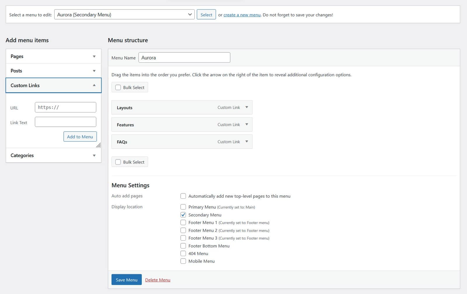
On mobile, all header layouts collapse to logo on the left and hamburger on the right. Tapping the hamburger opens a slide-in drawer with the navigation, search, contact information, social icons, and CTA buttons matching whatever the desktop version supports. Secondary panels (Apex, Overlay, Vanilla) are not shown in the mobile drawer. If you want a different navigation on mobile, you can assign a dedicated menu to the Mobile Menu location under Appearance → Menus.
To switch your header layout, go to Customize → Layouts → Header Layout.