

Aurora ships with thirteen archive layouts covering every style from a simple post grid to a full-width editorial layout. Switch between them from Appearance → Customize → Layouts → Archive Layout. The layout applies to all category, tag, date, search, and author archive pages.
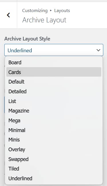
All archive layouts can be previewed on the demo site archives. Switch layouts from your Customizer to see how each one looks with your content.
Default
A 3-column grid. Each card shows the featured image with a category badge in the top-right corner, title below, excerpt, and author avatar with date at the bottom. A reliable starting point that works across all content types. Supports masonry.
Magazine
A single-column full-width layout. A small icon appears at the top center. The title is centered below it, followed by category, author, and date in a single row. A large full-width image sits below the header block, with an excerpt and a “Continue reading…” link below the image.
Cards
A 3-column grid. Each card has an image with rounded top corners, category and date as plain text below the image, and a title below that. No excerpt, no author. Each card has a visible drop shadow. Supports masonry.
Detailed
A 3-column grid. Image on top with a category badge in the top-right corner. Author avatar and date below the image. Title below that. Excerpt below the title. A “View post” outlined button at the bottom of each card. Supports masonry.
List
Single-column full-width rows. Each row shows a large image on the left half, with category (in the link color) and date on the upper right, title below, excerpt, and post tags listed horizontally with dividers between them. On mobile, the image moves to the top and content stacks below.
Mega
A single-column full-width layout. Large full-width image. Category badge below the image. Title in all-caps. Excerpt. Author avatar and date. “Read More” text link at the bottom.
Minimal
A 3-column grid. Image on top with a category badge in the top-right corner. Title below. Author avatar and date below the title. No excerpt, no button. The simplest card layout. Supports masonry.
Minis
Two posts per row on desktop, one per row on tablet, single column on mobile. Each row shows a square thumbnail on the left with category, date, title, and excerpt on the right. A thin horizontal line separates each row. No author, no button.
Swapped
Full-width rows where each post spans the entire content width. The image takes one half and the content — category, date, title, excerpt, and tags — takes the other, on a fixed dark background. Rows alternate sides. The dark background is fixed and can be overridden with CSS. On mobile, the image moves to the top and the dark content block sits below.
Tiled
A 4-column grid on desktop where each post occupies two adjacent cells: one for the image and one for the content (category, title, date). The image and content cells alternate positions across the grid, creating a checkerboard rhythm. A small arrow connects each image cell to its content cell. Drops to 2 columns on tablet and a single column on mobile.
Board
A 3-column grid. Each card has a visible border with the date and category label at the top, followed by the image and title below. No excerpt, no author. Supports masonry, which lets posts stack at varying heights rather than sitting in fixed-height rows.
Underlined
Single-column full-width rows separated by thin horizontal lines. Each row shows a large day number on the far left with month and year below it, a thumbnail in the center-left, and category, title, and excerpt on the right. The date format is fixed and does not follow the WordPress date format setting. On mobile, the date overlays the top-left of the image and content stacks below.
Overlay
A 3-column grid. Full-height image cards with rounded corners. Category badge, title, and excerpt are overlaid directly on the image in white text, positioned at the bottom of the card. No separate content area below the image. Supports masonry.
Masonry
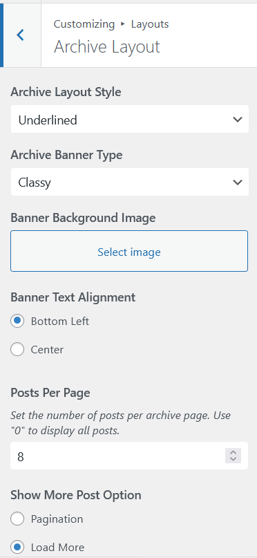
Masonry is not a separate layout. It is a toggle available on six layouts: Default, Board, Cards, Detailed, Overlay, and Minimal. When enabled, posts fill vertical space naturally rather than sitting in fixed-height rows. Enable it under Layouts → Archive Layout → Enable Masonry Layout.
Per-Archive Overrides
The layout set in the Customizer applies globally. To use a different layout for a specific category or tag, the Nova plugin adds override controls to the term edit screen.