

Aurora includes 8 header layouts. You can switch between them at any time from the Customizer, and the live preview updates immediately so you can compare designs before publishing.
How to Switch
- Go to Appearance → Customize.
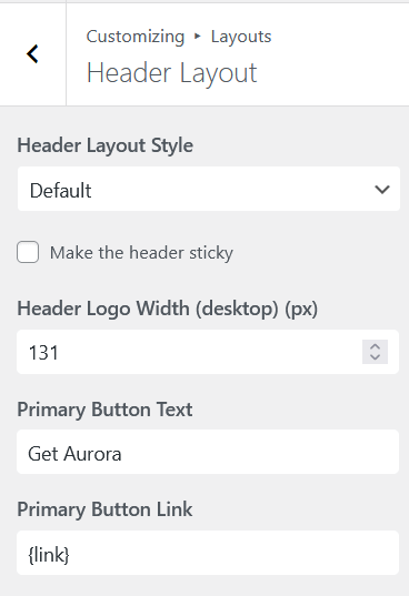
- Open Layouts → Header Layout.
- Click Header Layout.
- Select a layout from the dropdown.
- Watch the preview update on the right.
- Click Publish when you are happy with your choice.
The 8 Header Layouts
See the full header layouts comparison for detailed structure and screenshots.
Default
A single-bar header with logo, navigation, search, and two CTA buttons.
Vanilla
A single-bar header with a hamburger that opens a slide-in panel containing search, CTAs, contact, and socials.
Apex
A two-bar header with social icons and navigation on the top bar, logo and a CTA button on the main bar, and a hamburger that toggles a secondary menu dropdown.
Detailed
A two-bar header with contact information and socials on the top bar, navigation and two CTA buttons on the main bar.
Elegant
A two-bar header with a transparent main bar where only the pill-shaped nav takes the header colors.
Overlay
A two-bar header. The lower bar has a fixed near-white background (the only hard-coded color in any Aurora header) and holds the navigation, hamburger toggle, and search. The upper bar takes your header colors and holds socials, the centered logo, and two CTA buttons.
Thin
A narrow vertical strip fixed to the left edge that expands to show full navigation, contacts, socials, and CTAs.
Upright
A full-height vertical panel on the left side of the screen, always visible, with navigation running down it.
Features Available Across All Headers
- Logo (image or site title text fallback)
- Primary navigation menu
- Mobile menu with hamburger toggle and slide-in drawer
- Search icon or form
- Social icons
- Up to 2 CTA buttons
Contact information appears on Detailed, Elegant, Thin, and Vanilla. The secondary menu appears in a hamburger-triggered panel on Apex, Overlay, and Vanilla.
Sticky Header
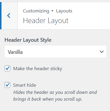
The six horizontal headers (Apex, Default, Detailed, Elegant, Overlay, Vanilla) support a sticky header mode that keeps the header fixed at the top of the viewport as visitors scroll. To enable it, go to Layouts → Header Layout → Sticky Header and toggle it on. The two vertical layouts (Thin and Upright) are always fixed by nature and do not need the toggle.
Mobile Behavior
All 8 header layouts collapse to logo on the left and hamburger on the right on mobile. Tapping the hamburger opens a slide-in drawer containing the same elements supported by the desktop version of that layout (navigation, search, contacts, socials, CTAs), except secondary panels which are not shown in the mobile drawer.