

- Aurora Quick Start: Install, Activate, and Set Up in 10 Minutes
- First Steps After Installing Aurora: A New User Checklist
- How to Activate Your Aurora License Key
- How to Install Aurora from a ZIP File
- System Requirements: WordPress and PHP Versions Aurora Needs
- Upgrading from Aurora Trial to Aurora Pro
- Using a Staging Site to Test Aurora Before Going Live
- What the 30-Day Free Trial Includes (and How to Start It)
- Aurora Customizer Conditional Settings Explained
- Aurora Customizer Overview: What Every Panel Does
- Aurora Navigation Menu Locations Explained
- Aurora's Custom Content Sections: Ads, Banners, and Newsletter Forms
- How Real-Time Preview Works in the Aurora Customizer
- How to Assign a Primary Menu
- How to Assign the 404 Navigation Menu
- How to Choose a Date Format in Aurora
- How to Configure Responsive Logo Widths
- How to Create a Footer Bottom Bar Menu
- How to Set Your Site Width in Aurora
- How to Use Aurora's CSS Variables to Override Site Content
- Saving and Publishing Customizer Changes
- All Aurora Header Features
- Aurora Header Layouts: All 8 Designs Compared
- How to Add a Logo to Your Header
- How to Add CTA Buttons to the Header
- How to Add Social Icons to the Header
- How to Add Social Media Links to the Header
- How to Configure the Sticky Header
- How to Display Contact Info in the Header
- How to Display Contact Info in the Header and Footer
- How to Set Up the Mobile Menu (Hamburger + Drawer)
- All Aurora 404 Page Features
- Aurora 404 Page Layouts: All 5 Designs Compared
- Aurora Archive Layouts: All 13 Designs Compared
- Aurora Author Page Layouts: All 4 Designs Compared
- Aurora Homepage Layouts: All 5 Designs Compared
- Aurora Search Results Layouts: All 3 Designs Compared
- Aurora Single Post Layouts: All 10 Designs Compared
- Aurora's Layout System Explained: How 53 Templates Create 5,000+ Combinations
- How to Add Social Links to an Author Profile
- How to Configure Archive Settings
- How to Configure Single Post Settings
- How to Configure the Author Page
- How to Configure the Homepage Layout
- How to Configure the Search Page
- How to Customise the Archive Banner
- How to Set Up Homepage Content Sections
- How to Set Up Posts in Homepage Sections
- How to Set Up Your Author Profile (Bio, Photo, and Social Links)
- How to Show or Hide the Sidebar
- How to Switch 404 Page Layouts
- How to Switch Archive Layouts
- How to Switch Author Page Layouts
- How to Switch Footer Layouts
- How to Switch Header Layouts
- How to Switch Homepage Layouts
- How to Switch Search Results Layouts
- How to Switch Single Post Layouts
- What "Layout" Means in Aurora (vs. a Page Builder)
- All Aurora Footer Features
- Aurora Footer Layouts: All 5 Designs Compared
- How to Add a Bio and Logo to Your Footer
- How to Add a Logo to Your Header
- How to Configure Footer Recent Posts (Default, Detailed, Simple)
- How to Control Footer Logo Width on Desktop, Tablet, and Mobile
- How to Set Up Footer Menus (Columns 1–3 + Bottom Bar)
- How to Show or Hide Footer Social Icons
- All Social Networks Aurora Supports
- Aurora Admin Dashboard Widget: What It Shows and Why
- Aurora and Core Web Vitals: How the Theme Affects Your PageSpeed Score
- Aurora PageSpeed and Performance: What the Theme Does for You
- Aurora RTL Support: Setting Up a Right-to-Left Site
- Aurora Translation Files: Available Languages
- Aurora's AJAX Load More: How It Works
- Aurora's Clean HTML Output: What It Means for SEO and Performance
- Aurora's Reading Time: How It Works and Where It Appears
- How Aurora Adds Rich Schema Without a Plugin
- How Aurora Handles Google Fonts Preconnect
- How Aurora Is Built for SEO
- How Aurora Loads CSS: Why It's Fast by Default
- How Aurora's Search Works
- How to Configure Social Share Buttons (All 10 Platforms)
- How to Enable and Configure the Drop Cap
- How to Translate Aurora into Your Language
- How to Use Aurora Without a Page Builder
- Using Aurora with Elementor
- Using Aurora with the Block Editor (Gutenberg)
- Using Aurora with WooCommerce
- Why Aurora Loads Font Awesome Locally (No CDN)
- Aurora Typography System: Four Independent Font Categories
- How to Change Heading Fonts (H1–H6 Individually)
- How to Change the Body Font (Family, Size, Weight, and More)
- How to Change the Menu Font and Button Font
- How to Set Responsive Font Sizes (Desktop, Tablet, Mobile)
- How to Use Google Fonts in Aurora
- How Nova Templates Appear in the Customizer Dropdown
- How Nova's CSS Loads Alongside Aurora's
- How to Override Layouts Per Author Using Nova
- How to Override Layouts Per Category Using Nova
- How to Override Layouts Per Post Using Nova
- Introduction to Nova
- Nova vs. Aurora: Which Templates Come From Where
- How to Add a Custom Banner Above the Header
- How to Add a Custom Body Class Based on Category
- How to Add a Notification Bar Above the Aurora Header
- How to Add Custom CSS to Aurora Without Editing Theme Files
- How to Change the Read More Button Text in Aurora
- How to Disable Aurora's Drop Cap on Specific Posts
- How to Limit Post Title Length on Archives with CSS
- How to Make Dropdowns Display in Columns of 2 or More
- How to Override Aurora's Site Width on a Specific Page
- How to Reverse the Order of Header Columns and Rows
- How to Style Drop Caps with CSS
- How to Style the Aurora Sidebar
- How to Use Aurora's CSS Variables to Override Site Content
- How to Use Custom Fonts Without Google Fonts
- Using a Child Theme with Aurora
Last updated:
Aurora gives you independent width controls for your logo at each screen size, so it scales down gracefully on smaller devices without you having to upload separate images.
Header Logo Widths
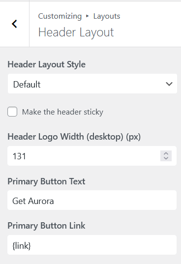
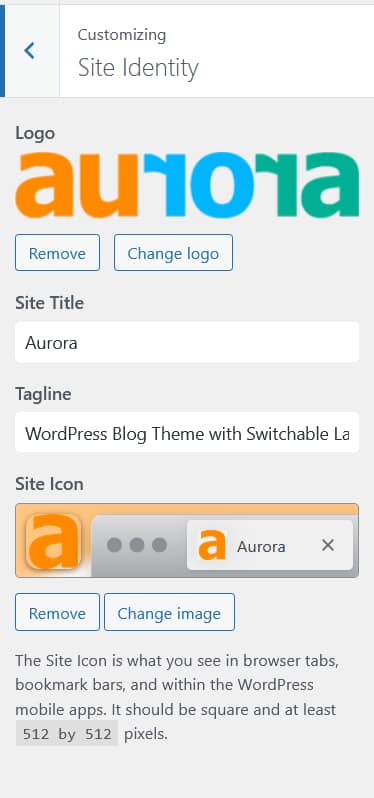
Go to Appearance → Customize → Layouts → Header Layout and look for the header logo width controls:
| Setting | Default | Range |
|---|---|---|
| Desktop logo width | 80px | 40px – 400px |
| Tablet logo width | 70px | 40px – 400px |
| Mobile logo width | 60px | 40px – 400px |
Footer Logo Widths
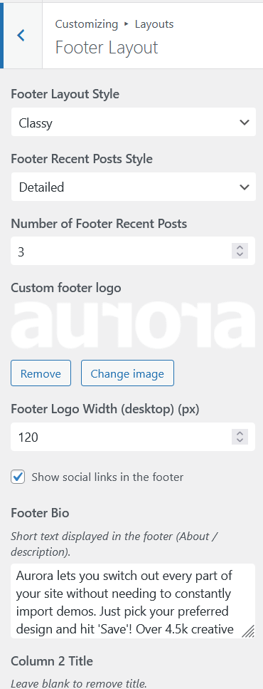
The footer has its own logo and its own set of width controls. Go to Appearance → Customize → Layouts → Footer Layout:
| Setting | Default | Range |
|---|---|---|
| Desktop logo width | 150px | 40px – 400px |
| Tablet logo width | 150px | 40px – 400px |
| Mobile logo width | 150px | 40px – 400px |
The footer logo is separate from the header logo. You can upload a different image for each. The footer logo only appears on footer layouts that support it; the Stripped layout does not include a logo area.
Tips
- Upload your logo at 2× the maximum display size you intend to use so it stays sharp on high-density screens.
- If your logo looks too large on mobile, reduce the mobile width setting rather than uploading a smaller image.
- The width controls set the rendered width; height scales proportionally to preserve the logo’s aspect ratio.