

On smaller screens, Aurora collapses the primary navigation into a hamburger icon. Tapping it opens a slide-in drawer containing the full navigation. This behavior is automatic on all 8 header layouts. No configuration is required to make it work.
How the Mobile Menu Works
When the viewport width drops below Aurora’s mobile breakpoint, the desktop navigation is hidden and replaced with a hamburger icon in the header. Tapping the icon slides in a full-height drawer panel from the side of the screen. The drawer contains the navigation menu and closes when the visitor taps outside it or taps the close button.
Nested menu items, including submenus and child pages, are displayed with an accordion toggle. Tapping a parent item expands its children inline, keeping everything contained within the drawer without secondary menus or flyouts.
Assigning a Separate Mobile Menu
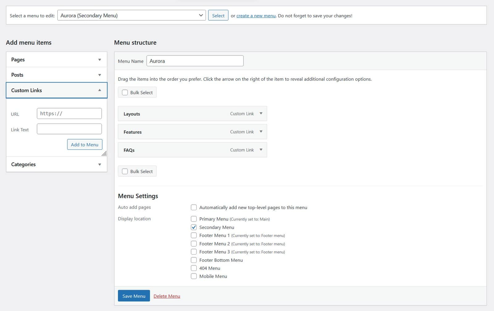
By default, the mobile drawer shows the same menu assigned to the Primary Menu location. If you want the mobile navigation to be different from the desktop navigation (for example, a simplified menu with fewer items), you can assign a separate menu to the Mobile Menu location.
- Go to Appearance → Menus.
- Create a new menu with the items you want on mobile.
- Under Menu Settings, check Mobile Menu.
- Save the menu.
Once a menu is assigned to the Mobile Menu location, it replaces the primary menu in the mobile drawer. The desktop navigation is unaffected.
If No Mobile Menu Is Assigned
If no menu is assigned to the Mobile Menu location, Aurora uses the primary menu in the mobile drawer automatically. You only need to configure the Mobile Menu location if you want the mobile navigation to differ from the desktop one.
Mobile Menu and Vertical Headers
The Upright and Thin vertical headers behave differently on mobile. Since they are side panels rather than top bars, Aurora collapses them into a hamburger-triggered drawer on smaller screens, using the same slide-in behavior used by horizontal header layouts, adapted for the vertical layout.