
Footer
 By Daniel Ekay
•
May 18, 2026
•
1 min read
By Daniel Ekay
•
May 18, 2026
•
1 min read
How to Control Footer Logo Width on Desktop, Tablet, and Mobile
By Daniel Ekay
•
May 18, 2026
•
1 min read
- Aurora Quick Start: Install, Activate, and Set Up in 10 Minutes
- First Steps After Installing Aurora: A New User Checklist
- How to Activate Your Aurora License Key
- How to Install Aurora from a ZIP File
- System Requirements: WordPress and PHP Versions Aurora Needs
- Upgrading from Aurora Trial to Aurora Pro
- Using a Staging Site to Test Aurora Before Going Live
- What the 30-Day Free Trial Includes (and How to Start It)
- Aurora Customizer Conditional Settings Explained
- Aurora Customizer Overview: What Every Panel Does
- Aurora Navigation Menu Locations Explained
- Aurora's Custom Content Sections: Ads, Banners, and Newsletter Forms
- How Real-Time Preview Works in the Aurora Customizer
- How to Assign a Primary Menu
- How to Assign the 404 Navigation Menu
- How to Choose a Date Format in Aurora
- How to Configure Responsive Logo Widths
- How to Create a Footer Bottom Bar Menu
- How to Set Your Site Width in Aurora
- How to Use Aurora's CSS Variables to Override Site Content
- Saving and Publishing Customizer Changes
- All Aurora Header Features
- Aurora Header Layouts: All 8 Designs Compared
- How to Add a Logo to Your Header
- How to Add CTA Buttons to the Header
- How to Add Social Icons to the Header
- How to Add Social Media Links to the Header
- How to Configure the Sticky Header
- How to Display Contact Info in the Header
- How to Display Contact Info in the Header and Footer
- How to Set Up the Mobile Menu (Hamburger + Drawer)
- All Aurora 404 Page Features
- Aurora 404 Page Layouts: All 5 Designs Compared
- Aurora Archive Layouts: All 13 Designs Compared
- Aurora Author Page Layouts: All 4 Designs Compared
- Aurora Homepage Layouts: All 5 Designs Compared
- Aurora Search Results Layouts: All 3 Designs Compared
- Aurora Single Post Layouts: All 10 Designs Compared
- Aurora's Layout System Explained: How 53 Templates Create 5,000+ Combinations
- How to Add Social Links to an Author Profile
- How to Configure Archive Settings
- How to Configure Single Post Settings
- How to Configure the Author Page
- How to Configure the Homepage Layout
- How to Configure the Search Page
- How to Customise the Archive Banner
- How to Set Up Homepage Content Sections
- How to Set Up Posts in Homepage Sections
- How to Set Up Your Author Profile (Bio, Photo, and Social Links)
- How to Show or Hide the Sidebar
- How to Switch 404 Page Layouts
- How to Switch Archive Layouts
- How to Switch Author Page Layouts
- How to Switch Footer Layouts
- How to Switch Header Layouts
- How to Switch Homepage Layouts
- How to Switch Search Results Layouts
- How to Switch Single Post Layouts
- What "Layout" Means in Aurora (vs. a Page Builder)
- All Aurora Footer Features
- Aurora Footer Layouts: All 5 Designs Compared
- How to Add a Bio and Logo to Your Footer
- How to Add a Logo to Your Header
- How to Configure Footer Recent Posts (Default, Detailed, Simple)
- How to Control Footer Logo Width on Desktop, Tablet, and Mobile
- How to Set Up Footer Menus (Columns 1–3 + Bottom Bar)
- How to Show or Hide Footer Social Icons
- All Social Networks Aurora Supports
- Aurora Admin Dashboard Widget: What It Shows and Why
- Aurora and Core Web Vitals: How the Theme Affects Your PageSpeed Score
- Aurora PageSpeed and Performance: What the Theme Does for You
- Aurora RTL Support: Setting Up a Right-to-Left Site
- Aurora Translation Files: Available Languages
- Aurora's AJAX Load More: How It Works
- Aurora's Clean HTML Output: What It Means for SEO and Performance
- Aurora's Reading Time: How It Works and Where It Appears
- How Aurora Adds Rich Schema Without a Plugin
- How Aurora Handles Google Fonts Preconnect
- How Aurora Is Built for SEO
- How Aurora Loads CSS: Why It's Fast by Default
- How Aurora's Search Works
- How to Configure Social Share Buttons (All 10 Platforms)
- How to Enable and Configure the Drop Cap
- How to Translate Aurora into Your Language
- How to Use Aurora Without a Page Builder
- Using Aurora with Elementor
- Using Aurora with the Block Editor (Gutenberg)
- Using Aurora with WooCommerce
- Why Aurora Loads Font Awesome Locally (No CDN)
- Aurora Typography System: Four Independent Font Categories
- How to Change Heading Fonts (H1–H6 Individually)
- How to Change the Body Font (Family, Size, Weight, and More)
- How to Change the Menu Font and Button Font
- How to Set Responsive Font Sizes (Desktop, Tablet, Mobile)
- How to Use Google Fonts in Aurora
- How Nova Templates Appear in the Customizer Dropdown
- How Nova's CSS Loads Alongside Aurora's
- How to Override Layouts Per Author Using Nova
- How to Override Layouts Per Category Using Nova
- How to Override Layouts Per Post Using Nova
- Introduction to Nova
- Nova vs. Aurora: Which Templates Come From Where
- How to Add a Custom Banner Above the Header
- How to Add a Custom Body Class Based on Category
- How to Add a Notification Bar Above the Aurora Header
- How to Add Custom CSS to Aurora Without Editing Theme Files
- How to Change the Read More Button Text in Aurora
- How to Disable Aurora's Drop Cap on Specific Posts
- How to Limit Post Title Length on Archives with CSS
- How to Make Dropdowns Display in Columns of 2 or More
- How to Override Aurora's Site Width on a Specific Page
- How to Reverse the Order of Header Columns and Rows
- How to Style Drop Caps with CSS
- How to Style the Aurora Sidebar
- How to Use Aurora's CSS Variables to Override Site Content
- How to Use Custom Fonts Without Google Fonts
- Using a Child Theme with Aurora
Last updated:
Aurora’s footer logo has its own set of responsive width controls, independent from the header logo. You can set a different size at each screen breakpoint so the logo scales down gracefully on smaller devices.
Where to Find the Settings
- Go to Appearance → Customize.
- Open Layouts → Footer Layout.
- Adjust the three logo width fields.
| Setting | Default | Range |
|---|---|---|
| Desktop logo width | 150px | 40px – 400px |
| Tablet logo width | 150px | 40px – 400px |
| Mobile logo width | 150px | 40px – 400px |
Uploading the Footer Logo
The footer logo is uploaded separately from the header logo. The upload field is also under Customize → Footer. You can use the same image or a different version (a white or light variant works well on darker footer backgrounds).
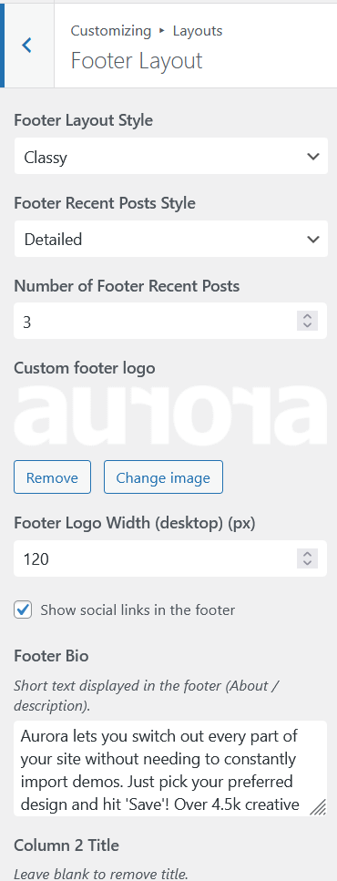
If no footer logo is uploaded, the width controls have no effect.
Tips
- Upload your logo at 2× the intended display size for sharp rendering on high-density screens.
- The width controls set the rendered width; height scales proportionally to preserve the aspect ratio.
- The footer logo only appears on footer layouts that include a logo area. The Stripped layout does not.
For header logo width settings, see How to Configure Responsive Logo Widths.