
How to Use Aurora’s CSS Variables to Override Site Content
 By Daniel Ekay
•
May 18, 2026
•
By Daniel Ekay
•
May 18, 2026
•
Aurora outputs every color, font, and layout value as a CSS custom property directly into the page <head>. This means you can override any of these values from the Customizer’s Additional CSS field without editing a single theme file and without needing a child theme.
But there’s more to it than just overriding values. Because these are live variables, you can also reference them as values for other elements. If you want a custom button to use the same color you set as your link hover color, you just point to that variable. Your Customizer setting becomes the single source of truth, and everything that references it updates automatically.
How to Add Your Overrides
- Go to Appearance → Customize → Additional CSS.
- Paste your CSS into the field.
- The live preview updates immediately.
- Click Publish when satisfied.
All overrides go on the :root selector, which sets them globally across the entire site. You can also scope them to a specific page or element.
Using Variables as Values
This is where CSS variables become genuinely useful. Instead of hardcoding a color into a custom element, reference a variable Aurora already outputs. If you later change that color in the Customizer, your custom element updates too.
Match a custom element to your link hover color
Say you have a custom badge or label and want its background to match whatever you set as the link hover color in the Customizer.
.my-badge {
    background-color: var(--link-hover-color);
    color: #fff;
}
Style a drop cap using your button color
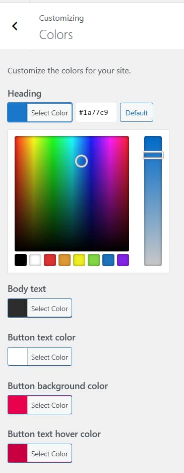
Aurora outputs a drop cap on posts where it is enabled. If you want the drop cap background to match your button color rather than the default:
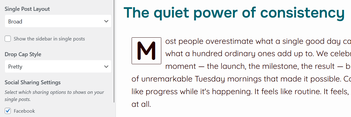
body.dropcase-bold .aurora-dropcap::first-letter {
    background-color: var(--button-background-color);
    color: var(--button-text-color);
}
Style form elements to match your color scheme
Contact forms and comment forms inherit browser defaults unless you style them. Reference Aurora’s variables to bring them into your color scheme without hardcoding anything.
input[type="text"],
input[type="email"],
textarea {
    border-color: var(--link-color);
    color: var(--body-text-color);
}

input[type="text"]:focus,
input[type="email"]:focus,
textarea:focus {
    border-color: var(--link-hover-color);
    outline: none;
}
Apply a Customizer color to any custom element
The same principle works for any element you add via a page builder, a widget, or custom HTML. Point to the variable and the element inherits whatever your Customizer setting is.
.my-custom-section {
    background-color: var(--site-background-color);
    border-left: 3px solid var(--button-background-color);
}
How to Override the Variables Themselves
Global override
Set a variable on :root to change it everywhere on the site. Use this when you want a value the Customizer does not expose directly.
:root {
    --link-hover-color: #c60041;
    --menu-letter-spacing-desktop: 0.05em;
}
Scoped override – single page
Use a page-specific body class to scope the change. WordPress adds a class like .page-id-42 to the body on every page. Inspect your page in a browser to find its ID.
.page-id-42 {
    --header-background-color: #000;
    --menu-text-color: #fff;
}
Scoped override – single post type
WordPress adds .single-post, .archive, .home, and similar classes to the body. Use these to scope changes to specific page types.
.single-post {
    --body-font-size-desktop: 18px;
    --body-line-height-desktop: 1.8;
}

.archive {
    --site-background-color: #f8f8f8;
}
Scoped override – specific element
Variables cascade down the DOM. Setting a variable on a specific element overrides it only within that element’s subtree.
.site-footer {
    --footer-background-color: #111;
    --footer-text-color: #ccc;
    --footer-link-color: #fff;
}
Why This Approach Is Better Than Overriding Properties Directly
You could override Aurora’s styles by writing .site-header { background: red; }, but that approach breaks if Aurora updates its selectors or adds specificity. Overriding the variable instead means Aurora’s own templates continue to use the variable, so your override flows through the theme naturally and survives updates.
It also keeps your Additional CSS lean. One variable change can update dozens of elements at once, and referencing a variable as a value means your custom elements stay in sync with your Customizer settings automatically.
Full Reference: Aurora’s CSS Custom Properties
Colors
For a full breakdown of every Customizer color and what it controls, see the color system reference.
:root {
    /* Typography */
    --heading-color: ;
    --body-text-color: ;
    --link-color: ;
    --link-hover-color: ;

    /* Buttons */
    --button-background-color: ;
    --button-text-color: ;
    --button-background-hover-color: ;
    --button-text-hover-color: ;

    /* Header */
    --topbar-background-color: ;
    --header-background-color: ;
    --menu-text-color: ;
    --menu-text-hover-color: ;
    --menu-text-active-color: ;
    --header-icon-color: ;

    /* Footer */
    --footer-background-color: ;
    --footer-text-color: ;
    --footer-link-color: ;

    /* Site */
    --sidebar-background-color: ;
    --site-background-color: ;
}
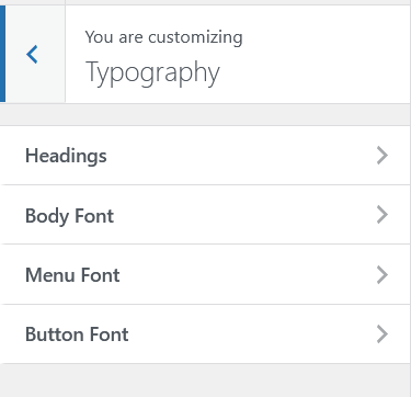
Typography – Body
:root {
    --body-font-family: ;
    --body-font-size-desktop: ;
    --body-font-size-tablet: ;
    --body-font-size-mobile: ;
    --body-line-height-desktop: ;
    --body-line-height-tablet: ;
    --body-line-height-mobile: ;
    --body-letter-spacing-desktop: ;
    --body-letter-spacing-tablet: ;
    --body-letter-spacing-mobile: ;
    --body-word-spacing-desktop: ;
    --body-word-spacing-tablet: ;
    --body-word-spacing-mobile: ;
    --body-font-weight: ;
    --body-font-style: ;
    --body-text-transform: ;
    --body-text-decoration: ;
}
Typography – Headings
Each heading level (H1–H6) has its own independent set of variables. Replace h1 with h2, h3, etc. for the other levels.
:root {
    --h1-font-family: ;
    --h1-font-size-desktop: ;
    --h1-font-size-tablet: ;
    --h1-font-size-mobile: ;
    --h1-line-height-desktop: ;
    --h1-line-height-tablet: ;
    --h1-line-height-mobile: ;
    --h1-letter-spacing-desktop: ;
    --h1-letter-spacing-tablet: ;
    --h1-letter-spacing-mobile: ;
    --h1-word-spacing-desktop: ;
    --h1-word-spacing-tablet: ;
    --h1-word-spacing-mobile: ;
    --h1-font-weight: ;
    --h1-font-style: ;
    --h1-text-transform: ;
    --h1-text-decoration: ;
}
Typography – Menu
:root {
    --menu-font-family: ;
    --menu-font-size-desktop: ;
    --menu-font-size-tablet: ;
    --menu-font-size-mobile: ;
    --menu-line-height-desktop: ;
    --menu-line-height-tablet: ;
    --menu-line-height-mobile: ;
    --menu-letter-spacing-desktop: ;
    --menu-letter-spacing-tablet: ;
    --menu-letter-spacing-mobile: ;
    --menu-word-spacing-desktop: ;
    --menu-word-spacing-tablet: ;
    --menu-word-spacing-mobile: ;
    --menu-font-weight: ;
    --menu-font-style: ;
    --menu-text-transform: ;
    --menu-text-decoration: ;
}
Typography – Buttons
:root {
    --button-font-family: ;
    --button-font-size-desktop: ;
    --button-font-size-tablet: ;
    --button-font-size-mobile: ;
    --button-line-height-desktop: ;
    --button-line-height-tablet: ;
    --button-line-height-mobile: ;
    --button-letter-spacing-desktop: ;
    --button-letter-spacing-tablet: ;
    --button-letter-spacing-mobile: ;
    --button-word-spacing-desktop: ;
    --button-word-spacing-tablet: ;
    --button-word-spacing-mobile: ;
    --button-font-weight: ;
    --button-font-style: ;
    --button-text-transform: ;
    --button-text-decoration: ;
}
Layout
:root {
    --site-width: ;
    --header-logo-width-desktop: ;
    --header-logo-width-tablet: ;
    --header-logo-width-mobile: ;
    --footer-logo-width-desktop: ;
    --footer-logo-width-tablet: ;
    --footer-logo-width-mobile: ;
}