
Aurora Typography System: Four Independent Font Categories
 By Daniel Ekay
•
May 18, 2026
•
By Daniel Ekay
•
May 18, 2026
•
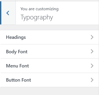
Aurora gives you independent font control for four text categories. Each category has its own family, size, weight, style, and spacing settings, all configurable from the Customizer with live preview.
The Four Font Categories
| Category | What It Controls |
|---|---|
| Body | All paragraph text, list items, and general content copy |
| Headings | All heading elements (H1 through H6), configurable individually |
| Menu | Navigation items across all header and footer menus |
| Buttons | CTA buttons, read-more links, share buttons, Load More button |
What You Can Control Per Category
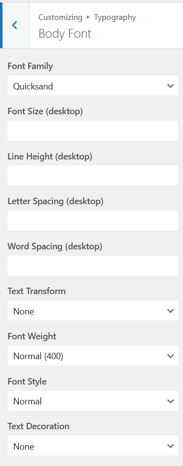
Each font category exposes the same set of axes:
| Setting | Description |
|---|---|
| Font Family | Google Fonts family name. Search by name in the Customizer field |
| Font Size (Desktop) | Base font size on desktop viewports |
| Font Size (Tablet) | Font size on tablet-width viewports |
| Font Size (Mobile) | Font size on mobile viewports |
| Font Weight | Thickness of the characters, from 100 (thin) to 900 (black) |
| Font Style | Normal or italic |
| Line Height | Vertical spacing between lines of text |
| Letter Spacing | Horizontal spacing between individual characters |
| Word Spacing | Horizontal spacing between words |
| Text Transform | None, uppercase, lowercase, or capitalize |
| Text Decoration | None, underline, or line-through |
Heading Levels
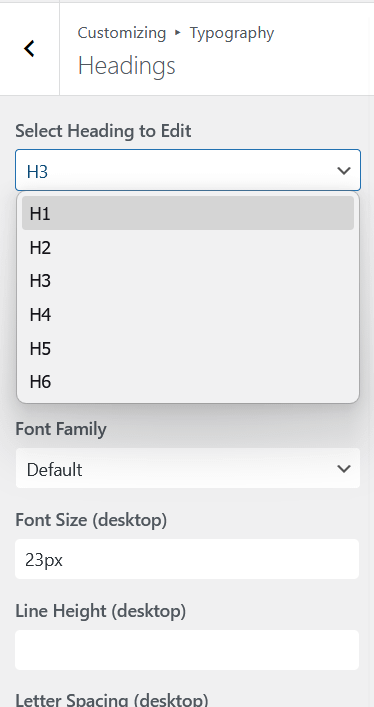
The Headings category lets you configure H1 through H6 independently. Each heading level has its own font family, size, weight, line height, letter spacing, and every other typography axis.
To save time, the font family cascades down to lower heading levels until another level overrides it. If you set H1’s font family and leave H2 through H6 at Default, all six headings use H1’s font family. If you set H1 to one family and H4 to another, H2 and H3 inherit from H1, and H5 and H6 inherit from H4. Every other axis (size, weight, line height, spacing, etc.) stays independent per heading.
How It Works Under the Hood
Every typography setting is output as a CSS custom property in the page <head>. For example, your body font size becomes --body-font-size-desktop, --body-font-size-tablet, and --body-font-size-mobile. Templates inherit these variables rather than hardcoding any values, which means every layout responds to your typography settings automatically.
Responsive font sizes are applied via CSS media queries. The desktop value loads by default, the tablet value at 768px and below, and the mobile value at 480px and below.

Google Fonts
All font families in Aurora are sourced from Google Fonts. Type a font name into the family field in the Customizer to select it. Aurora loads a preconnect hint for Google Fonts in the page head to reduce font load latency.
See How to Use Google Fonts in Aurora for more detail on finding and applying fonts.