

Aurora supports up to 2 call-to-action buttons in the header. These appear alongside your navigation and are configurable from the Customizer. No code required.
How to Add a CTA Button
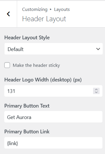
- Go to Appearance → Customize → Layouts.
- Open Header Layout.
- Find Primary Button Text and enter the label for your first button.
- Fill in Primary Button Link with the URL it should point to.
- Repeat with Secondary Button Text and Secondary Button Link for a second button.
- Click Publish.
Leave the label or link field empty to hide a button entirely.
Button Styling
Header CTA buttons take their colors from your header’s menu settings, not the global button settings. The primary button uses your menu text color as its background, with the header background color as the text. The secondary button is transparent with a border and text in the menu text color. Hover states shift to the menu hover color.
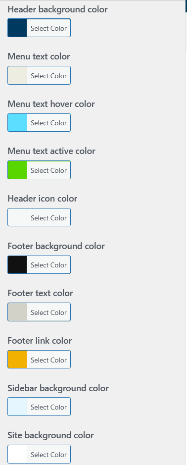
To change the button colors, adjust these settings under Customize → Colors:
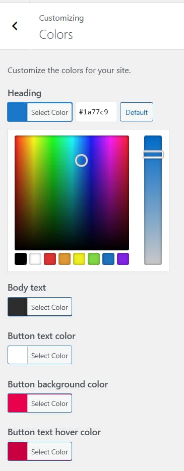
- Menu Text Color: controls the primary button fill and secondary button text
- Menu Text Hover Color: controls both buttons on hover
- Header Background Color: controls the text color on the primary button
Font styling for the buttons follows your header’s typography settings.
Some header layouts that display only a single button may render it as outlined with a transparent background rather than filled. If your button appears hollow when you expect it to be filled, this is normal behavior for that layout, not a misconfiguration. For a full overview of what each layout supports, see all header features.
Two-Button Layouts
Using two buttons works well for sites with a primary and secondary action, for example “Book a Call” as the primary and “See Our Work” as the secondary. Aurora displays them side by side in the header. They are already visually distinct out of the box: the primary button is filled (menu text color background), while the secondary is outlined and transparent. No extra CSS needed to tell them apart.