

Aurora gives you full control over every color on your site from the Customizer. Setting up a dark color scheme is a matter of updating the right color settings in the right order. There is no dark mode toggle. You set your colors directly, which gives you more control over the exact look. For an overview of every available color setting, see the color system reference.
The Colors to Change
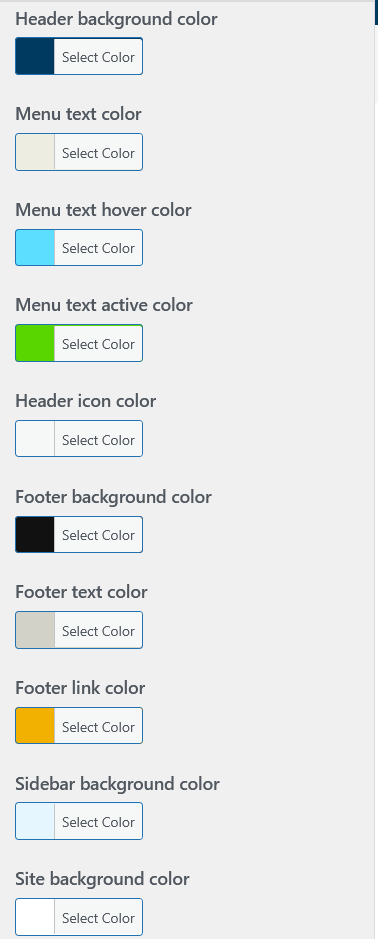
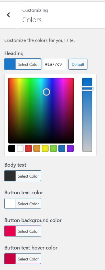
A dark scheme typically involves changing these settings:
| Setting | Location | Suggested dark value |
|---|---|---|
| Site background | Colors → Site Background | #0f0f0f or #1a1a1a |
| Body text | Colors → Body Text Color | #e0e0e0 or #d4d4d4 |
| Heading color | Colors → Heading Color | #ffffff or #f5f5f5 |
| Link color | Colors → Link Color | A bright accent like #5b9cf6 or your brand color |
| Link hover color | Colors → Link Hover Color | Slightly lighter or more saturated than link color |
| Header background | Colors → Header Colors | #111111 or #0d0d0d |
| Menu text | Colors → Header Colors | #ffffff or #e0e0e0 |
| Footer background | Colors → Footer Colors | #0a0a0a or #111111 |
| Footer text | Colors → Footer Colors | #aaaaaa or #999999 |
| Sidebar background | Colors → Sidebar Background | #1e1e1e or #222222 |
| Button background | Colors → Button Colors | Your accent color |
| Button text | Colors → Button Colors | #ffffff |
Recommended Order
Start with the site background and body text color. These two set the overall feel. Then work outward to the header and footer, then links and buttons. Setting colors in this order lets you judge each decision in context rather than making changes blindly.
Tips for a Polished Dark Scheme
- Avoid pure black. #0f0f0f or #111111 reads as dark without the harshness of #000000. Pure black next to white text creates too much contrast and causes eye strain on long reads.
- Reduce text brightness slightly. Off-white body text (#e0e0e0) is easier to read on dark backgrounds than pure white (#ffffff). Save pure white for headings and UI elements where you want maximum contrast.
- Pick one accent color and use it consistently. A single bright color for links, buttons, and interactive elements gives the dark scheme a clear visual language. See How to Change Link and Button Colors for more detail.
- Check archive and single post pages. After setting colors, browse your category pages and open a few posts in the live preview to make sure everything reads well in context, not just on the homepage.
Using CSS Variables for Fine-Tuning
Aurora outputs all color settings as CSS variables. If you need to fine-tune specific elements — for example, adjusting the drop cap border color or styling a form to match the dark scheme — you can reference these variables in Additional CSS without hardcoding any values.