
How to Change the Body Font (Family, Size, Weight, and More)
 By Daniel Ekay
•
May 18, 2026
•
By Daniel Ekay
•
May 18, 2026
•
The body font controls the appearance of all paragraph text, list items, and general content copy across your site. It is the most-read text on your blog, so getting it right has a significant impact on readability. Body font is one of four independent font categories in Aurora’s typography system.
How to Change the Body Font
- Go to Appearance → Customize.
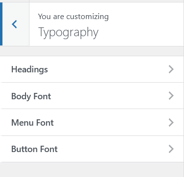
- Open Typography.
- Open Body Font.
- Adjust any of the available settings.
- The preview updates live as you make changes.
- Click Publish when satisfied.
Available Settings
Font Family
Type a Google Fonts family name to switch the body font. The default is Roboto. Popular alternatives for blog body text include Inter, Lato, Open Sans, Merriweather, and Source Serif 4.
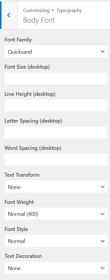
Font Size
Set independent sizes for desktop, tablet, and mobile. Aurora’s defaults are 17px on desktop and 16px on tablet and mobile. For long-form reading, sizes between 16px and 18px tend to be most comfortable.
Line Height
Controls the vertical space between lines of text. A line height between 1.5 and 1.8 is generally recommended for body text. This gives enough breathing room to make long paragraphs easy to read.
Font Weight
Controls the thickness of the characters. 400 is normal weight. 300 is light. Avoid going below 300 for body text as it can become hard to read at small sizes.
Letter Spacing
Adjusts the space between individual characters. Body text generally works best with letter spacing at 0 or very slightly positive. Large positive values are better suited to uppercase headings and buttons.
Word Spacing
Adjusts the space between words. Usually left at 0 for body text.
Text Transform
Sets capitalization. Leave at None for body text. Uppercase body text is very hard to read at length.
Readability Tips
- Use a serif font (Merriweather, Lora, Georgia) for a traditional editorial feel that works well for long articles
- Use a sans-serif font (Inter, Roboto, Open Sans) for a modern, clean look that reads well on screen at any size
- Keep desktop body size between 16px and 18px for comfortable reading
- Set line height between 1.6 and 1.75 for multi-paragraph content
- Test your body font choice on a real post in the Customizer preview before publishing