

Aurora lets you configure each heading level independently. H1 through H6 each have their own font family, size, weight, line height, letter spacing, word spacing, style, transform, and decoration. Heading fonts are one of four independent font categories in Aurora’s typography system.
How to Change Heading Fonts
- Go to Appearance → Customize → Typography.
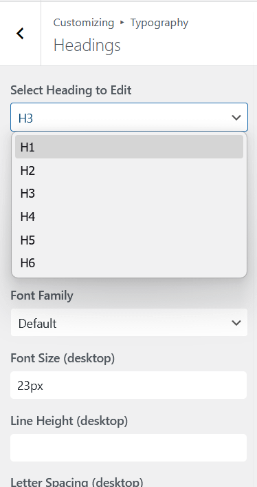
- Open Headings.
- Select the heading level you want to configure (H1, H2, H3, H4, H5, or H6).
- Set the font family, size (desktop, tablet, mobile), weight, line height, letter spacing, word spacing, style, transform, and decoration for that level.
- Repeat for the other levels you want to customise.
- Click Publish.
Font Family Cascade
To save you from setting the same font family on every heading, Aurora cascades the font family down to lower levels. If you set H1’s font family and leave H2 through H6 at Default, all six headings use H1’s family. If you set H1 to one family and H4 to another, H2 and H3 inherit from H1, and H5 and H6 inherit from H4. Every other setting (size, weight, line height, spacing) stays unique to each level regardless of the cascade.
Heading Size Defaults
| Heading | Where It Appears | Default Weight |
|---|---|---|
| H1 | Post titles, page titles, archive titles | 600 |
| H2 | Section headings within posts and pages | 600 |
| H3 | Sub-section headings, widget titles | 600 |
| H4–H6 | Minor headings, deep nested sections | 600 |
Pairing Heading and Body Fonts
A strong font pairing creates visual contrast between headings and body text. Some combinations that work well:
- Playfair Display + Lato: elegant serif headings with clean sans-serif body. Good for lifestyle and editorial blogs.
- Montserrat + Merriweather: geometric sans-serif headings with readable serif body. Works well for long-form writing.
- Inter + Inter: same family throughout. Clean, modern, and consistent. Works particularly well for tech and documentation sites.
- Oswald + Open Sans: condensed bold headings with neutral body. Strong choice for news and magazine layouts.
Letter Spacing on Headings
A small positive letter spacing value (0.02em to 0.05em) on headings can add a polished, editorial feel, especially on uppercase or small-caps heading styles. Avoid large letter spacing values on body-weight text as they reduce readability.
To change the color of your headings independently of body text, see heading color.