
How to Set Responsive Font Sizes (Desktop, Tablet, Mobile)
 By Daniel Ekay
•
May 18, 2026
•
By Daniel Ekay
•
May 18, 2026
•
Aurora lets you set independent font sizes for desktop, tablet, and mobile for every font category. This means your typography scales appropriately across devices without relying on fluid scaling or browser defaults. Responsive sizing is built into every category in Aurora’s typography system.

How It Works
For each font category, Body, Headings, Menu, and Buttons, Aurora provides three separate size fields: one for desktop, one for tablet, and one for mobile. The values you enter are output as CSS custom properties and applied via media queries:
- Desktop: applies at all widths above 768px
- Tablet: applies at 768px and below
- Mobile: applies at 480px and below
Where to Set Sizes
- Go to Appearance → Customize → Typography.
- Open any font category (Body, Headings, Menu, or Buttons).
- Find the Font Size (Desktop), Font Size (Tablet), and Font Size (Mobile) fields.
- Enter your values in pixels.
- Use the device toggle at the bottom of the Customizer to preview each breakpoint.
- Click Publish.
Heading Sizes Per Level
Heading font sizes are set per level (H1–H6), and each level has its own desktop, tablet, and mobile size. This lets you create a tighter size scale on mobile — where large H1 values can push content off screen — while maintaining a dramatic scale on desktop.
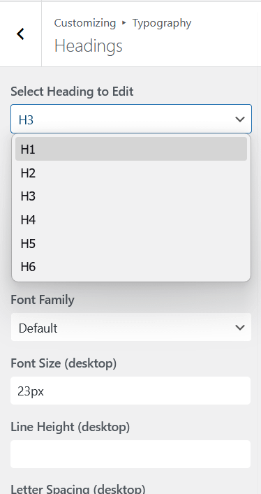
A common approach is to reduce H1 and H2 sizes on mobile by 20–30% from their desktop values while leaving H3–H6 unchanged, since smaller heading levels are already compact enough to work on small screens.
Recommended Starting Values
| Category | Desktop | Tablet | Mobile |
|---|---|---|---|
| Body | 17px | 16px | 16px |
| H1 | 36px | 28px | 24px |
| H2 | 28px | 24px | 20px |
| H3 | 22px | 20px | 18px |
| Menu | 15px | 15px | 15px |
| Buttons | 14px | 14px | 13px |
These are reasonable starting points. Adjust based on your chosen font family. Some fonts read larger or smaller than others at the same pixel size.