

Aurora’s drop cap styles are fully customizable with CSS. You can change colors, font family, size, spacing, borders, and more without touching any theme file. All overrides go into Appearance → Customize → Additional CSS.
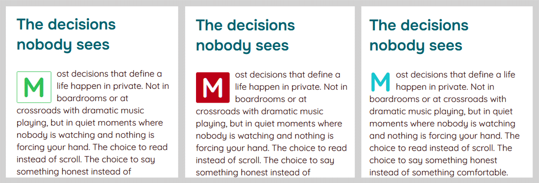
Before writing any custom CSS, it helps to know which selector to target. If you have not yet enabled the drop cap, do that first from the Customizer. Aurora applies a class to the <body> based on your selected drop cap style, and the drop cap element itself carries the class .aurora-dropcap. The ::first-letter pseudo-element is what you style.
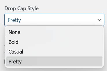
| Drop cap style | Body class | Full selector |
|---|---|---|
| Bold | dropcase-bold |
body.dropcase-bold .aurora-dropcap::first-letter |
| Casual | dropcase-casual |
body.dropcase-casual .aurora-dropcap::first-letter |
| Pretty | dropcase-pretty |
body.dropcase-pretty .aurora-dropcap::first-letter |
Changing Colors Using CSS Variables
Aurora already outputs your Customizer colors as CSS variables. Instead of hardcoding a color value, reference the variable directly. If you update the color in the Customizer later, the drop cap updates automatically. See the full CSS variable reference for all available variables.
Change the drop cap color to your link hover color
body.dropcase-bold .aurora-dropcap::first-letter {
    background-color: var(--link-hover-color);
}

body.dropcase-pretty .aurora-dropcap::first-letter {
    color: var(--link-hover-color);
    border-color: var(--link-hover-color);
}
Use your button colors for the Bold drop cap
The Bold style uses a filled background by default. Swap it to your button color scheme:
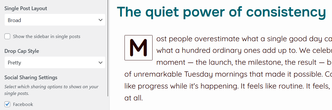
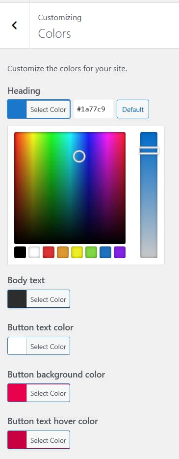
body.dropcase-bold .aurora-dropcap::first-letter {
    background-color: var(--button-background-color);
    color: var(--button-text-color);
}
Match the Casual drop cap to your heading color
The Casual style is plain text with no background. Give it a distinct color to add personality:
body.dropcase-casual .aurora-dropcap::first-letter {
    color: var(--link-color);
}
Changing the Font
By default the drop cap inherits your body font. You can override it with any font already loaded on your site, or reference Aurora’s font variables.
Use your heading font for the drop cap
body.dropcase-casual .aurora-dropcap::first-letter,
body.dropcase-bold .aurora-dropcap::first-letter,
body.dropcase-pretty .aurora-dropcap::first-letter {
    font-family: var(--h2-font-family);
}
Use a decorative Google Font
Load the font via Customize → Typography → Google Fonts first, then reference it by name:
body.dropcase-pretty .aurora-dropcap::first-letter {
    font-family: 'Playfair Display', serif;
    font-style: italic;
}
Adjusting Size and Spacing
Aurora sets the drop cap size in rem units. You can override it to any unit you prefer.
body.dropcase-bold .aurora-dropcap::first-letter {
    font-size: 5rem;
    margin-inline-end: 14px;
    margin-top: 6px;
}
If you want the size to scale differently on mobile, add a media query:
@media (max-width: 480px) {
    body.dropcase-bold .aurora-dropcap::first-letter {
        font-size: 3rem;
    }
}
Advanced: Redesigning a Style from Scratch
You can completely override any drop cap style and make it your own. The examples below show a few directions you might take.
Outlined letter with no fill
Works well with the Bold selector since it normally has a filled background:
body.dropcase-bold .aurora-dropcap::first-letter {
    background-color: transparent;
    color: var(--body-text-color);
    border: 2px solid var(--link-color);
    border-radius: 0;
    padding: 8px 12px;
}
Oversized initial with no box
A large, plain letter that floats beside the text with generous spacing:
body.dropcase-casual .aurora-dropcap::first-letter {
    font-size: 6rem;
    font-family: var(--h2-font-family);
    color: var(--link-hover-color);
    line-height: 0.8;
    margin-inline-end: 6px;
    margin-top: 4px;
}
Circular badge drop cap
A pill or circle shape around the letter. Works best with single characters that sit well inside a circle:
body.dropcase-pretty .aurora-dropcap::first-letter {
    background-color: var(--button-background-color);
    color: var(--button-text-color);
    border: none;
    border-radius: 50%;
    width: 3rem;
    height: 3rem;
    line-height: 3rem;
    text-align: center;
    padding: 0;
    font-size: 1.8rem;
    margin-inline-end: 12px;
    margin-top: 4px;
}font-size or padding.Applying a Drop Cap Style Only on Specific Posts
If you want a custom style on one post only, scope the override using the post’s body class. WordPress adds a class like .postid-42 to the body on every single post. Inspect the page in your browser to find the ID.
.postid-42 body.dropcase-bold .aurora-dropcap::first-letter,
.postid-42.dropcase-bold .aurora-dropcap::first-letter {
    background-color: #1a1a2e;
    color: #e0e0ff;
}