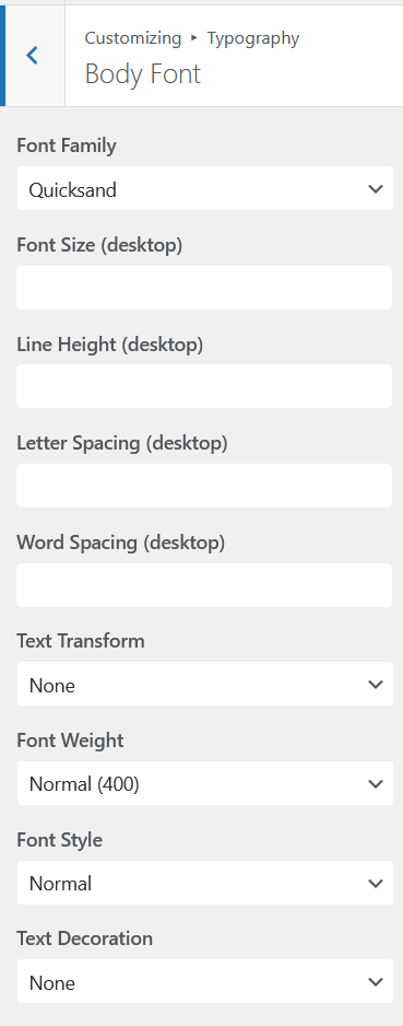
Aurora gives you independent typography control for navigation menus and buttons. These two categories often benefit from a distinct style, such as tighter letter spacing, a different weight, or uppercase text, to make them read as interface elements rather than body copy. Menu and button fonts are part of Aurora’s typography system.
Menu Font
The menu font applies to all navigation items across every header and footer menu location.
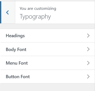
- Go to Appearance → Customize → Typography.
- Open Menu Font.
- Configure your preferred settings.
- Click Publish.
Common Menu Font Approaches
- Same family as headings, slightly smaller: creates cohesion between headings and navigation
- Uppercase + letter spacing: a classic navigation treatment. Set Text Transform to uppercase and Letter Spacing to 0.08em–0.12em for a clean, spaced-out nav
- Lighter weight than body: weight 300 or 400 for a refined, minimal feel in the header
Button Font
The button font applies to all buttons across the theme: header CTA buttons, read-more links on archives, share buttons on single posts, and the Load More button on archives.
- Go to Customize → Typography.
- Open Button Font.
- Configure your preferred settings.
- Click Publish.
Common Button Font Approaches
- Uppercase + medium weight: weight 500 or 600 with uppercase transform. Standard for action buttons and works across most brand styles
- Same as body, bolder: use your body font at weight 600–700 for a strong, readable button without introducing a third typeface
- Slightly tracked: letter spacing 0.05em–0.1em on uppercase button text improves readability at small sizes
Responsive Font Sizes
Both menu and button fonts support independent desktop, tablet, and mobile size settings. Navigation items and buttons typically need to be slightly smaller on mobile to fit within the constrained layout. Set your mobile size a point or two smaller than desktop if needed. See responsive font sizes for a full breakdown of how Aurora’s size breakpoints work.